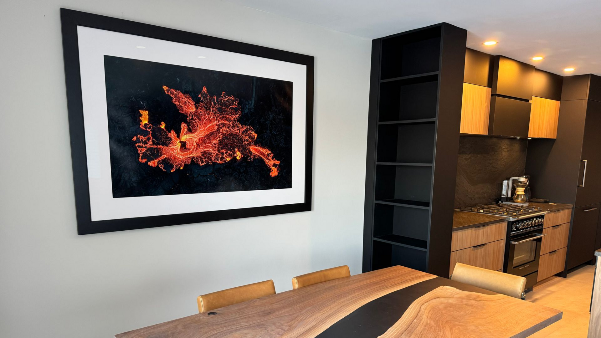
Most People Spend Hours Editing a Photo… Then Never See It Again
Most photographers spend hours capturing and editing an image, post it online, get likes, and then never look at it again.
We are living in a time where the process often stops at social media.
I believe photography was never meant to exist only on a screen.
A print turns a digital file into something real. It becomes something you can hold, hang on a wall, and enjoy for years.
The thing is, getting a great print starts long before you submit your file or hit print yourself.
Let's walk through the process, from planning the shot all the way to choosing the final paper.
Shoot With Purpose
This doesn't mean every time you pick up a camera needs to be some elaborate mission.
You can absolutely go out and shoot for fun but even when you're shooting casually, it helps to be intentional.
One of my favorite tools is PhotoPills. If you've never used it, it's a planning app that shows sun position, moon position, and Milky Way alignment before you ever leave the house.
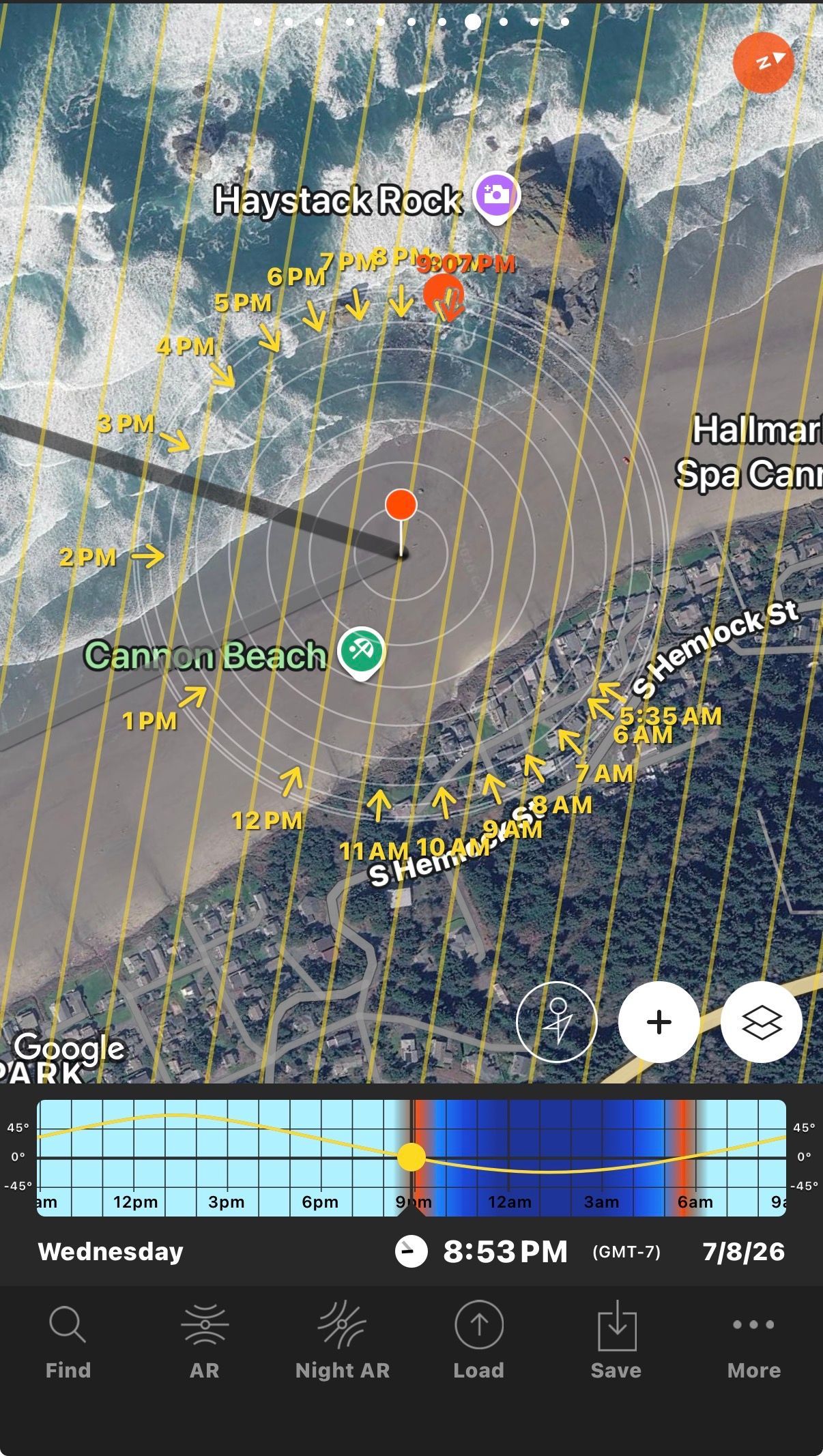
Instead of guessing, you're setting yourself up for success.
If you photograph people, it helps you see where the sun will be during a session so you can avoid harsh light.
If you photograph wildlife, you can plan for backlighting or directional light that adds more depth to your subject.
If you're a landscape photographer, you can figure out exactly when the light will hit the location the way you want it to.
Planning doesn't guarantee a great image, but it definitely improves your odds.
Execute in the Field
When you're actually taking the photograph, think about composition first.
Yes, Photoshop is powerful. Yes, Lightroom can fix a lot, but it's always easier to get things right in the field.
Give yourself options.
-Take a few steps back.
-Zoom in.
-Change your angle.
-Try different focal lengths.
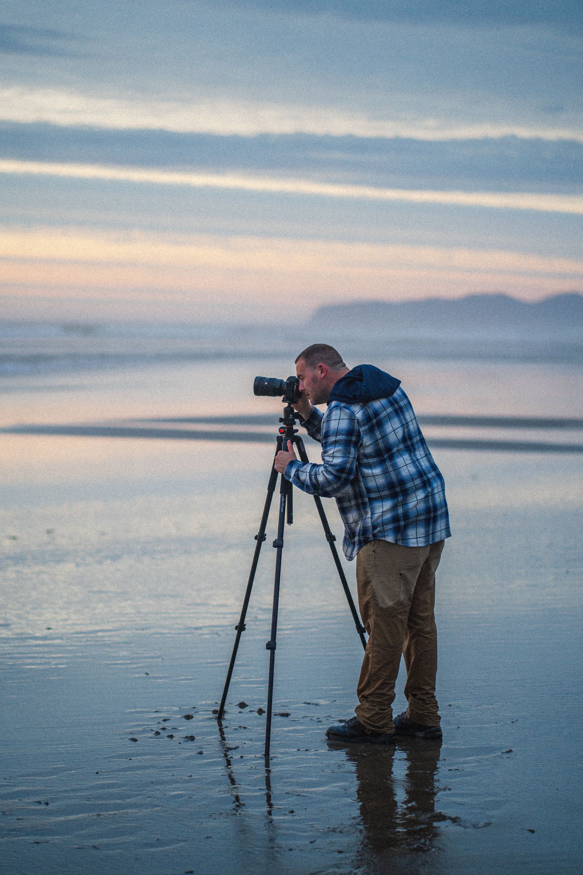
Solve Problems Before They Reach the Computer
One thing I see all the time is photographers saying, "I'll fix it in post." Sometimes that's necessary. Most of the time it isn't.
Look for distractions while you're shooting.
-Sticks sticking into the frame.
-People wandering into the background.
-Airplanes.
-Bright objects near the edges.
Instead of planning to remove them later, adjust your composition or wait a few seconds.
Every problem you solve in the field is one less thing you have to deal with during editing.
Post Processing
This is where you refine the image.
-Adjust your color.
-Adjust your tone.
-Fine tune your composition.
-Remove distractions if need be
-Apply sharpening.
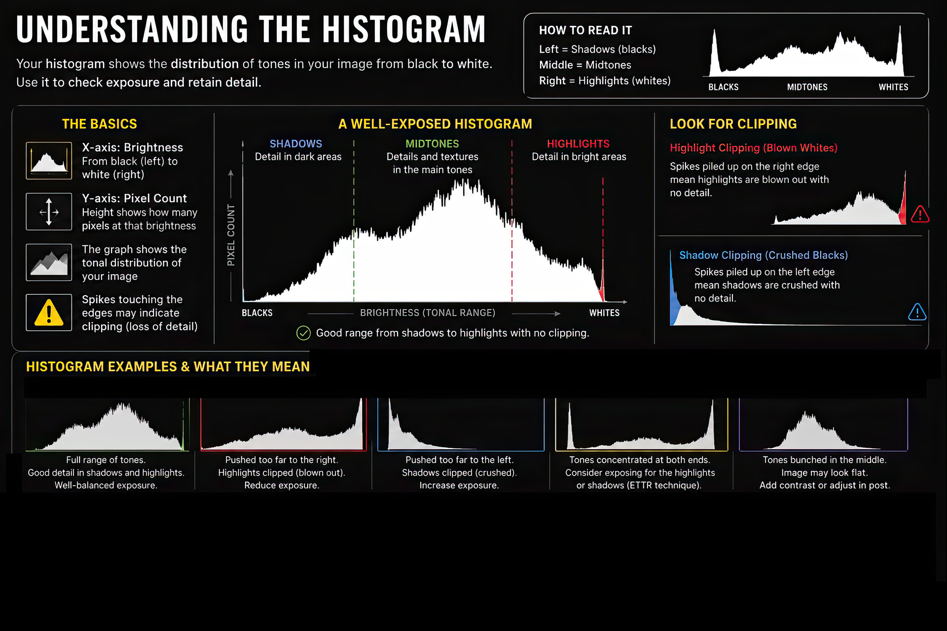
-Pay attention to white balance and your histogram.
Small issues that barely show up on a screen can become much more noticeable once the image is printed.
Your Screen Is Lying to You
This is probably the biggest issue I see when people start printing. If your prints don't match your screen, the printer usually isn't the problem, your monitor is.
Most people edit with their display brightness cranked all the way up. That works great for watching videos. It works terribly for printing.
Your monitor emits light. A print reflects light. Those are two completely different experiences.
When your monitor is too bright, you naturally darken your image while editing. Then the print arrives and looks darker than expected.
A simple rule:
If your image looks amazing at full screen brightness, there's a good chance your print is going to disappoint you.
For print work, your display should be dimmer than you think. Whites should not feel like a light source.
The image may feel slightly less vibrant than what you're used to seeing. That's actually much closer to how it will appear on paper.
Understanding Color Profiles
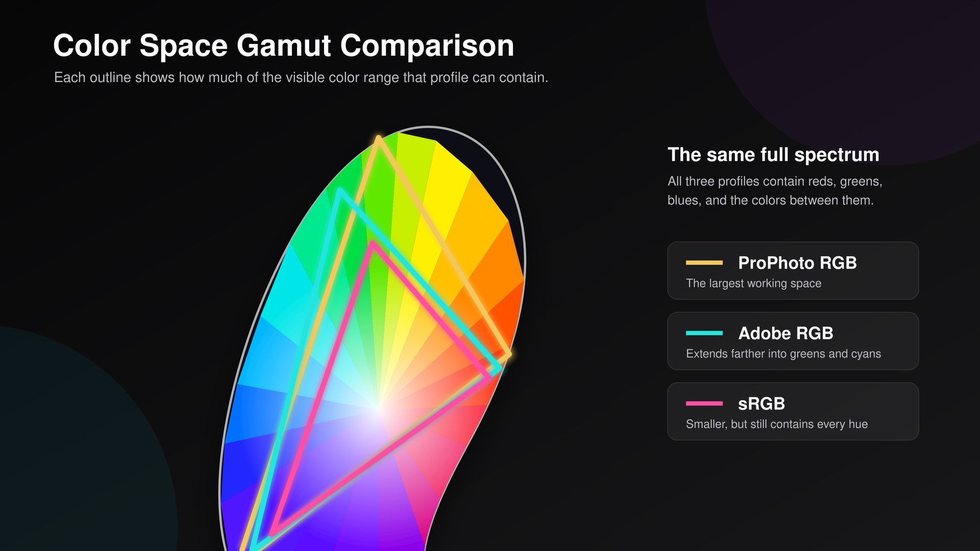
A color profile is simply a set of instructions that tells your monitor, software, and printer how to interpret color.
Without those instructions, colors can shift from one device to another.
The two color spaces photographers should know are sRGB and Adobe RGB.
sRGB
- Industry standard
- Most consistent option
- Works almost everywhere
- Safe and predictable
Adobe RGB
- Larger color gamut
- Better greens and blues
- Potentially more color information for print
- Requires a fully color-managed workflow
The problem isn't Adobe RGB.
The problem is using Adobe RGB in a workflow that doesn't support it. That's when colors start looking dull, washed out, or different than expected.
I've seen this happen many times. In fact, if someone uploads an Adobe RGB file to our website, it can create color shifts because the website assumes sRGB.
The simple takeaway:
If you want consistency, use sRGB.
If you fully understand your workflow and everything supports Adobe RGB, then Adobe RGB can give you a slight advantage.
Soft Proofing
Soft proofing is one of the most overlooked parts of printing.
It allows you to preview how an image will look on a specific paper before printing.
When you soft proof, you'll often notice:
- Colors shifting
- Shadows getting deeper
- Highlights changing
- Contrast changing
That's normal.
Your monitor can display colors that physically cannot exist in print.
Soft proofing helps you identify those differences before spending money on a print.
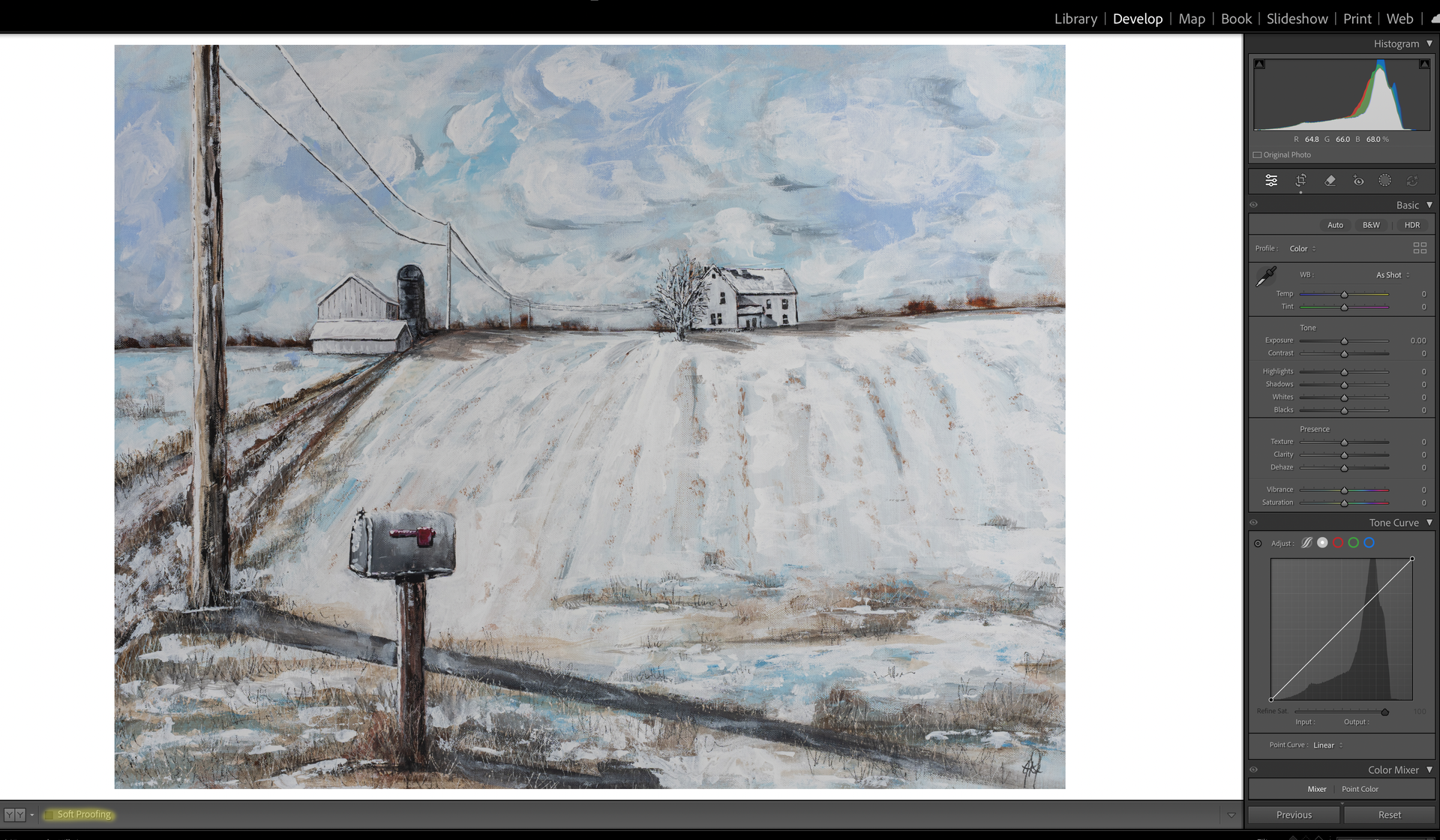
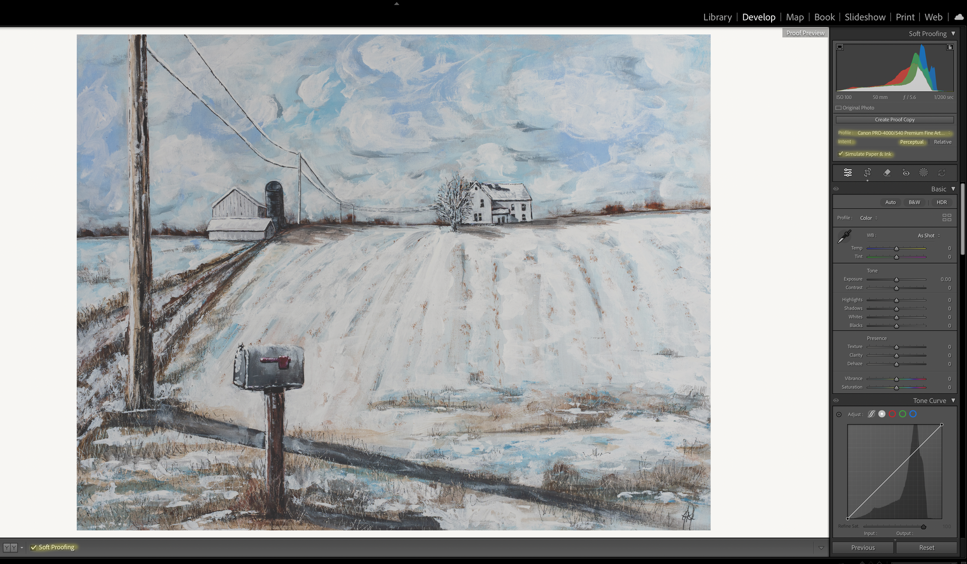
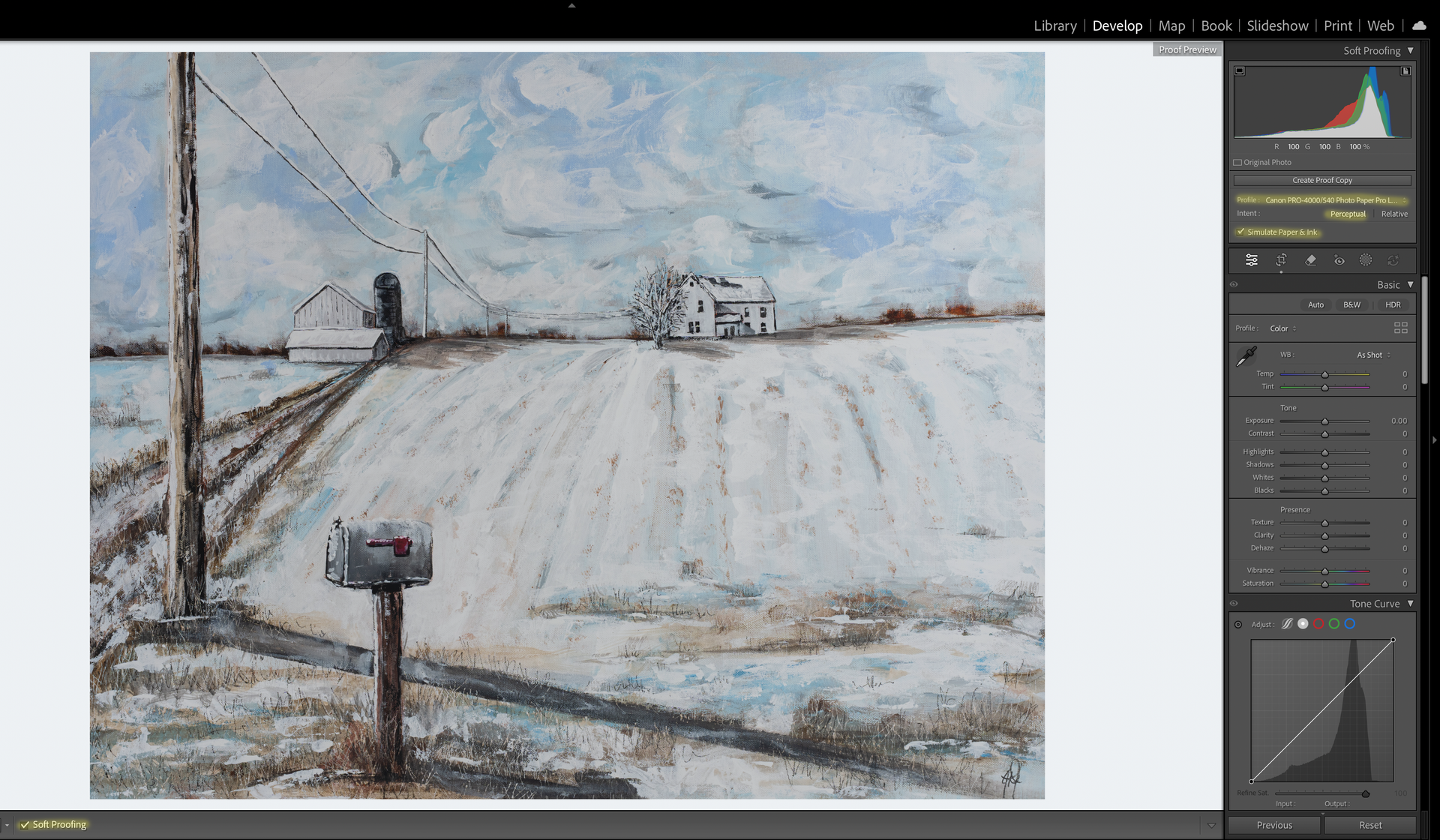
Below is a step by step on how to activate soft proofing.
Look at the difference between the two images once I select a profile.
You'll see that the first image that has a profile selected is a tad warmer compared to the last image that is cooler. If you look up in the top right corner at the histogram, you should notice is has slightly changed between the two.
File Formats
People spend a lot of time debating JPEG versus TIFF.
Honestly, for most people, it isn't nearly as big of a deal as they think.
JPEG
Perfectly fine for everyday printing.
TIFF
Great for large prints, fine art printing, and archival purposes.
The issue usually isn't JPEG.
The issue is opening, editing, and re-saving the same JPEG over and over again.
Resolution
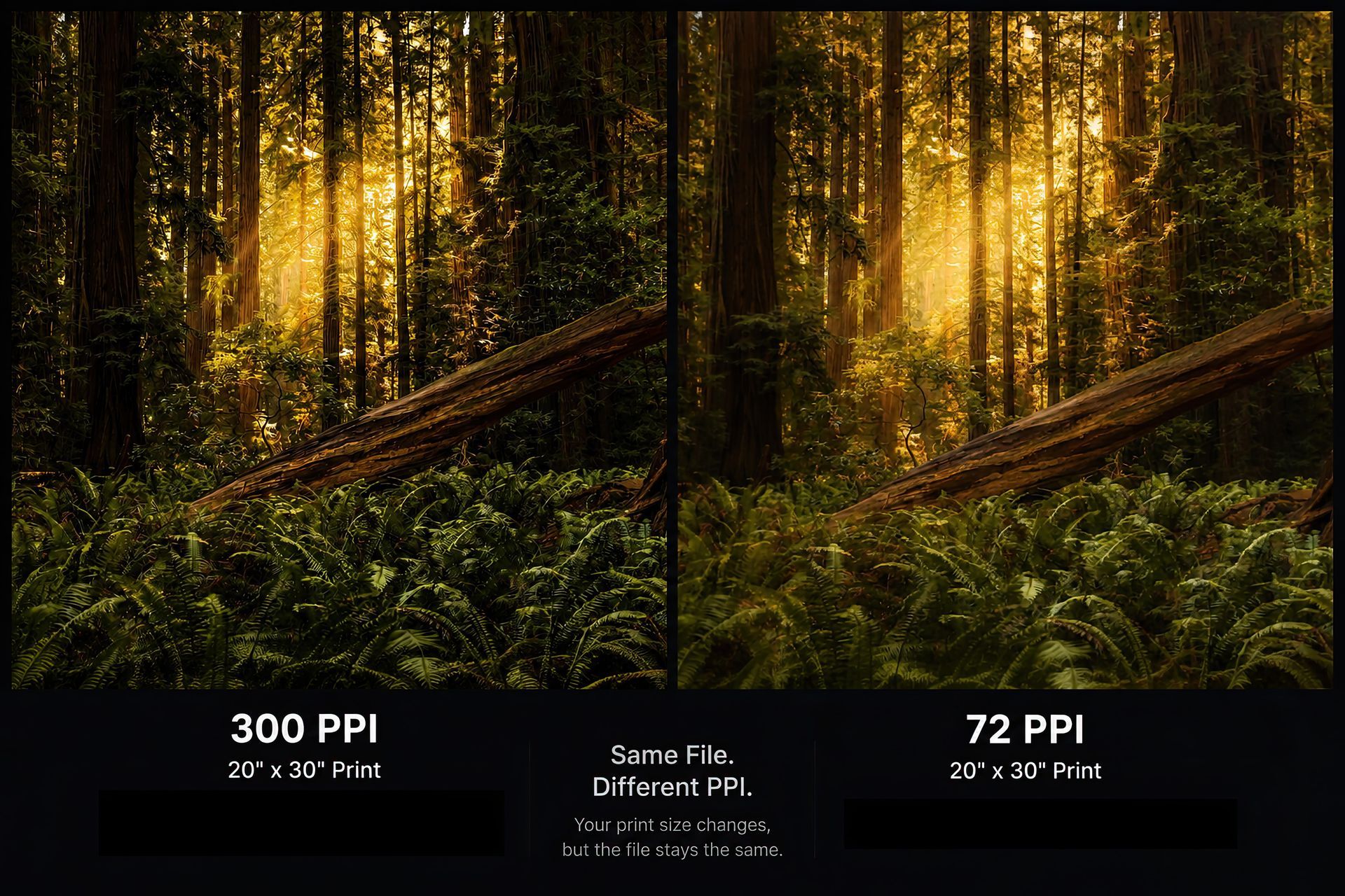
The traditional recommendation is 300 DPI.
That's ideal.
240 DPI is still excellent.
I've gone much lower and still produced prints that look fantastic.
Viewing distance plays a huge role.
Paper choice can also help.
A large wall piece viewed from several feet away does not require the same resolution as a small print viewed from arm's length.
Sharpening for Print
Think about it this way.
Screens emit light.
Prints absorb detail.
Because of that, prints often need slightly more sharpening than what looks perfect on your monitor.
If an image looks perfectly sharp on screen, it may end up looking a little soft in print.
Programs like Topaz can help.
If you're unsure about sharpening, many professional labs can handle that for you. We include sharpening as part of our lab correction service.
Common Problems We See
Certain issues jump out immediately in print.
Things like:
- Sensor spots
- Crooked horizons
- Fringing
- Chromatic aberration
- Distractions
They may be easy to miss on a monitor, but they become very obvious once the image is printed.
Think About Aspect Ratio
One of the biggest mistakes photographers make is forgetting about the final print size.
If you shoot in a 2:3 ratio and print an 8x10, something has to get cropped.
If you regularly print sizes like 8x10, 11x14, or square formats, start thinking about that while you're shooting.
Take a step back.
Leave yourself room.
That extra space can save an important part of the composition later.
Choosing Your Paper
Once the file is ready, it's time to decide how you want the image to be experienced.
Luster
Slight texture, slight sheen, great color and contrast. Probably the most versatile option available.
Glossy
Maximum color and contrast. Very reflective. Also loves fingerprints and scratches.
Fine Art Baryta
Deep blacks, rich contrast, slight texture, and a premium gallery feel.
Fine Art Pearl
Softer sheen than glossy with a clean, refined appearance.
Silk Baryta X
Very subtle texture, slight sheen, and an extremely premium feel.
Photo Rag Metallic
Matte surface with a metallic shimmer that changes depending on the viewing angle.
Photo Rag Ultra Smooth
Completely matte with no texture. Clean, modern, and understated.
Museum Etching
Beautiful texture with a watercolor-like feel. Lower contrast and more of a traditional fine art appearance.
Canvas or Metal?
Canvas
Soft texture, timeless appearance, and a painterly look.
Metal
High gloss, incredible vibrancy, and a clean modern presentation.
Neither one is better.
They simply create different experiences.
Don't Forget the Frame
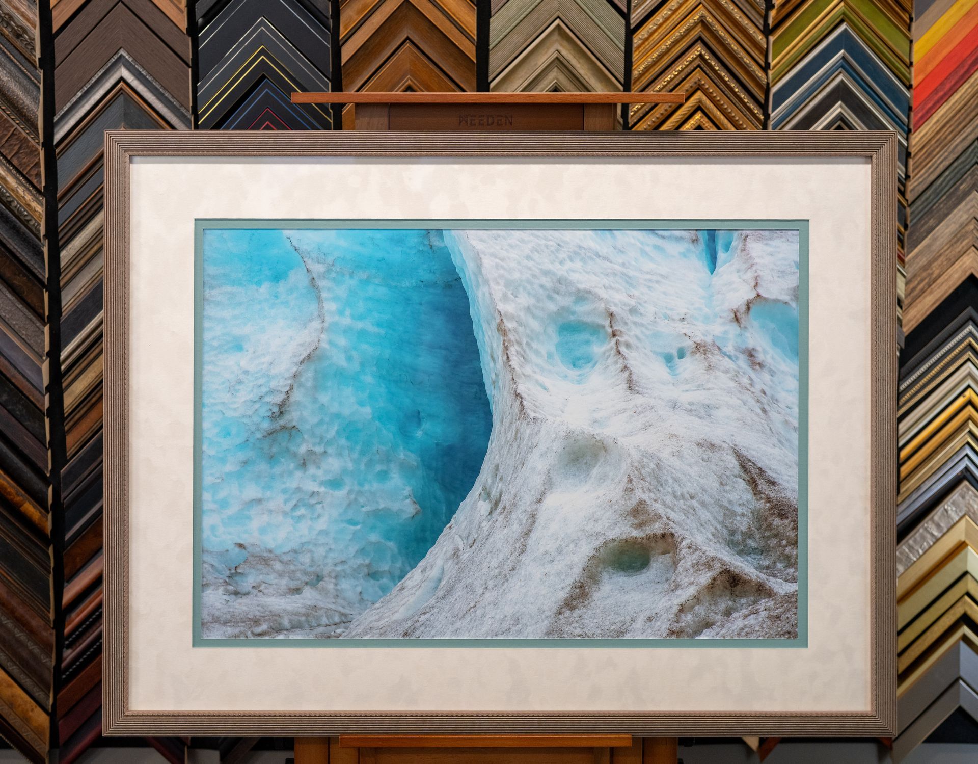
This is the step that turns a print into wall art.
A simple black frame and white mat can look fantastic.
When you start customizing frame styles, mat colors, and mat widths, you completely change how a piece feels.
The right frame should support the artwork, not compete with it.
Make Your Images Real
I hope this gives you a better understanding of how to control the final result.
Printing isn't just hitting a button.
It's the final step of the photographic process.
It's where all the planning, shooting, editing, and decision making come together.
Because at the end of the day, photography was never meant to live only on a phone screen.
Printing is what makes the image real.